
The Project
Wavelength is a mobile dating app that’s goal is to help individuals find deeper and more meaningful connections by matching people based on their personality type. As the sole UX/UI designer, I designed this project from inception to final design through research, ideation, and UX design principles
Duration: 4 weeks
Methods: User Interviews, Affinity Maps, Personas, Emotional Jourey, Business Model Canvas, POV/HMW, Sitemap, Task Flow, Wireframes, Prototyping, Feedback Grid
Tools: Figma, Adobe Illustrator, Miro
Duration: 4 weeks
Methods: User Interviews, Affinity Maps, Personas, Emotional Jourey, Business Model Canvas, POV/HMW, Sitemap, Task Flow, Wireframes, Prototyping, Feedback Grid
Tools: Figma, Adobe Illustrator, Miro
Context
The app works by asking users to take a personality quiz, adapted from the well-respected Myers Briggs (MBTI) test, to determine their personality type and match them with personality types that are most compatible.
Wavelength has also partnered with We’re Not Really Strangers (WRNS), a purpose driven card game and movement all about empowering meaningful connections. Once a match is made, Wavelength will use the prompts and questions created by WRNS to help users communicate with each other on a deeper level.
My challenge for this project was to build a mobile dating app that helps users create long-lasting and healthy relationships.
The Process

Research
User Interviews
With the goal of understanding what users value and find frustrating about existing dating apps, I conducted 1:1 interviews with 5 dating app users. In these interviews, I also wanted to understand the attitudes and expectations for an app that matches users based on complementary personality types as well as gauge users’ comfort levels on answering deeper and more intimate questions.
Affinity Maps
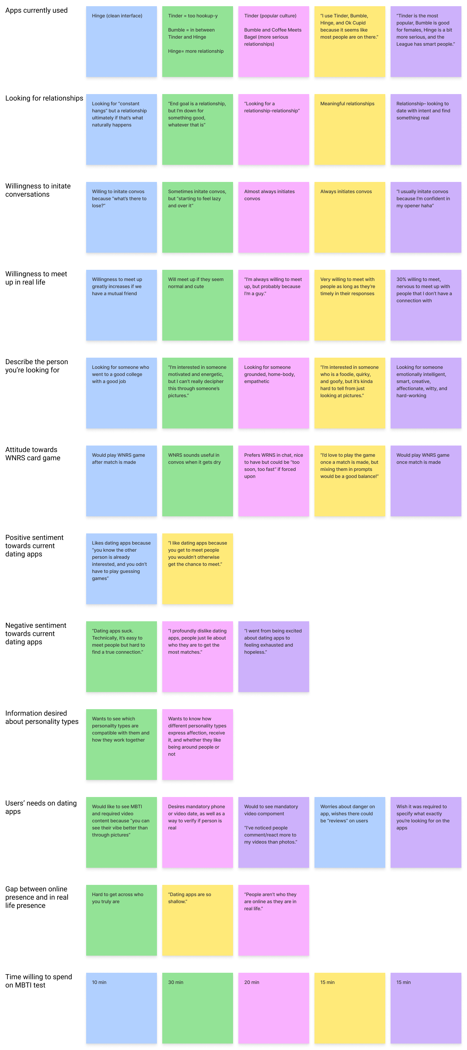
KEY FINDINGS & INSIGHTS

Users describe who they’re looking for with intrinsic qualities rather than physical qualities.
Users find there is a gap between how a person appears online and how they really are in real life.
Users are all seeking relationships as their end goals, but some are okay with casual dating for the time being.
Define
User Persona
Using the insights I gathered from my user interviews, I created a user persona to better understand the needs and frustrations of my users, and continued to revisit my persona in order to maintain a user-centric focus for the duration of the project.

Emotional Journey
With my persona in mind, I created an emotional journey to help me visualize a user’s emotional experience when interacting with Wavelength. I wanted to understand how the user might feel before, during, and after interacting with Wavelength.

Business Model Canvas
Since Wavelength is a start-up app, I created a business model canvas to describe Wavelength’s value proposition, infrastructure, customers, and finances to potential stakeholders. My business model canvas pointed me to areas where I needed to learn more, in order to produce a product that hits the sweet spot of where user and business needs overlap, as well as uncover areas of strength I could lean into.
Since Wavelength is a start-up app, I created a business model canvas to describe Wavelength’s value proposition, infrastructure, customers, and finances to potential stakeholders. My business model canvas pointed me to areas where I needed to learn more, in order to produce a product that hits the sweet spot of where user and business needs overlap, as well as uncover areas of strength I could lean into.

Point of View (POV) Statements and How Might We (HMW) Questions
As the last step in the “Define” phase, I created POV statements to allow me to ideate and solve my design challenge in a goal-oriented manner in which I keep a focus on my users, their needs, and my insights about them. Once I defined my POVs, I started asking HMW questions to explore ideas that would help prepare me for the “Ideation” phase.
As the last step in the “Define” phase, I created POV statements to allow me to ideate and solve my design challenge in a goal-oriented manner in which I keep a focus on my users, their needs, and my insights about them. Once I defined my POVs, I started asking HMW questions to explore ideas that would help prepare me for the “Ideation” phase.
- How might we create a more genuine, accurate sense of a users’ personality?
- How might we help users search and find who they’re looking for more effectively and efficiently?
- How might we help users establish connection?
- How might we help users maintain and continue a conversation once it gets “dry”?
Ideate
Sitemap
To begin ideating the information architecture of Wavelength, I created a sitemap by referencing design patterns from competitors like Tinder, Hinge, and Bubble and keeping my POVs and HMWs in mind.
To begin ideating the information architecture of Wavelength, I created a sitemap by referencing design patterns from competitors like Tinder, Hinge, and Bubble and keeping my POVs and HMWs in mind.

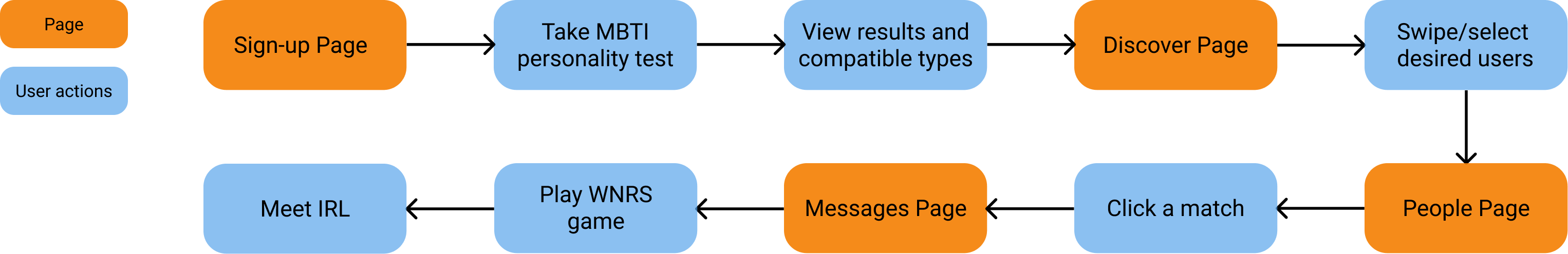
Task Flow
With my persona in mind, I created a task flow. This gave me a clear picture of the steps a user would need to take to get to their final goal and how to deliver this goal in the most intuitive way possible.
With my persona in mind, I created a task flow. This gave me a clear picture of the steps a user would need to take to get to their final goal and how to deliver this goal in the most intuitive way possible.
Wireframes
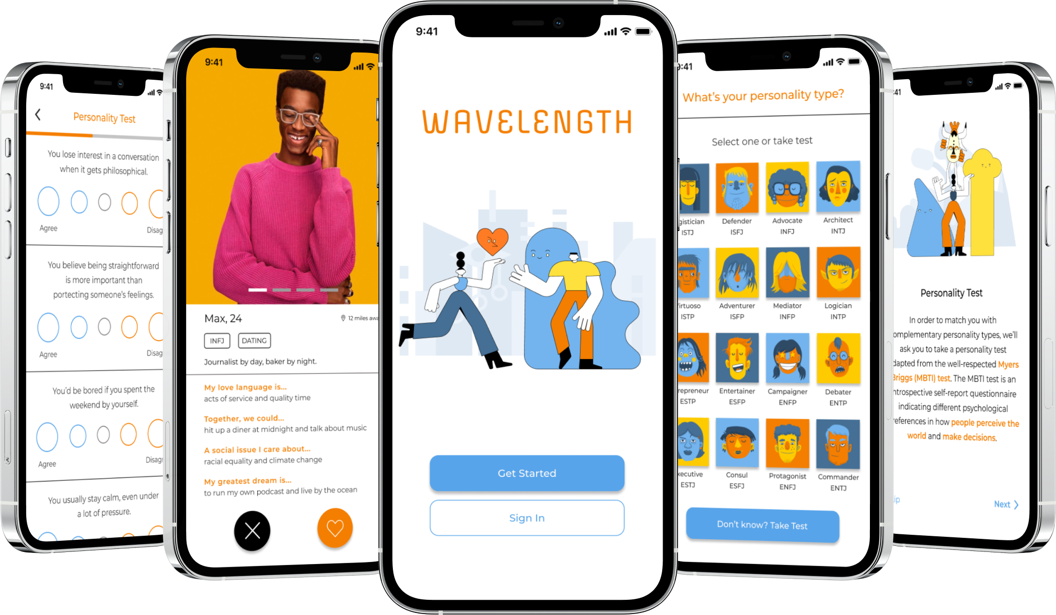
Following Nikki’s task flow, I sketched low-fidelity wireframes with pen and paper before digitalizing them on Figma to create mid-fidelity wireframes. I prioritized creating the following pages: Login/Sign up, Onboarding, Personality Test/Results, Discover, Filters, Matches/Messaging, Conversation Game.
Branding & UI Kits
Following Wavelength’s brand identity (playful & modern), I crafted a logo, color palette, font pairing, buttons, and other stylistic elements to create a comprehensive UI kit. For the brand colors, I chose orange because it felt warm, fun, and joyful while blue felt modern, reliable, and calming.

UI Designs
By applying the visual design to my wireframes, I created responsive UI designs for the following pages: Login/Sign up, Onboarding, Personality Test/Results, Discover, Filters, Matches/Messaging, Conversation Game.
By applying the visual design to my wireframes, I created responsive UI designs for the following pages: Login/Sign up, Onboarding, Personality Test/Results, Discover, Filters, Matches/Messaging, Conversation Game.
Test
Prototype
In order to conduct usability testing, I created a desktop prototype using Figma.
Testing Objectives
- how the Conversation Game works?
Usability Testing
By conducting usability tests with 5 dating app users, I was able to refine what users found useful and change items that were confusing. Users were asked to complete the task flow to test the main features of the app. They were also asked how they felt about the app in general.
Results
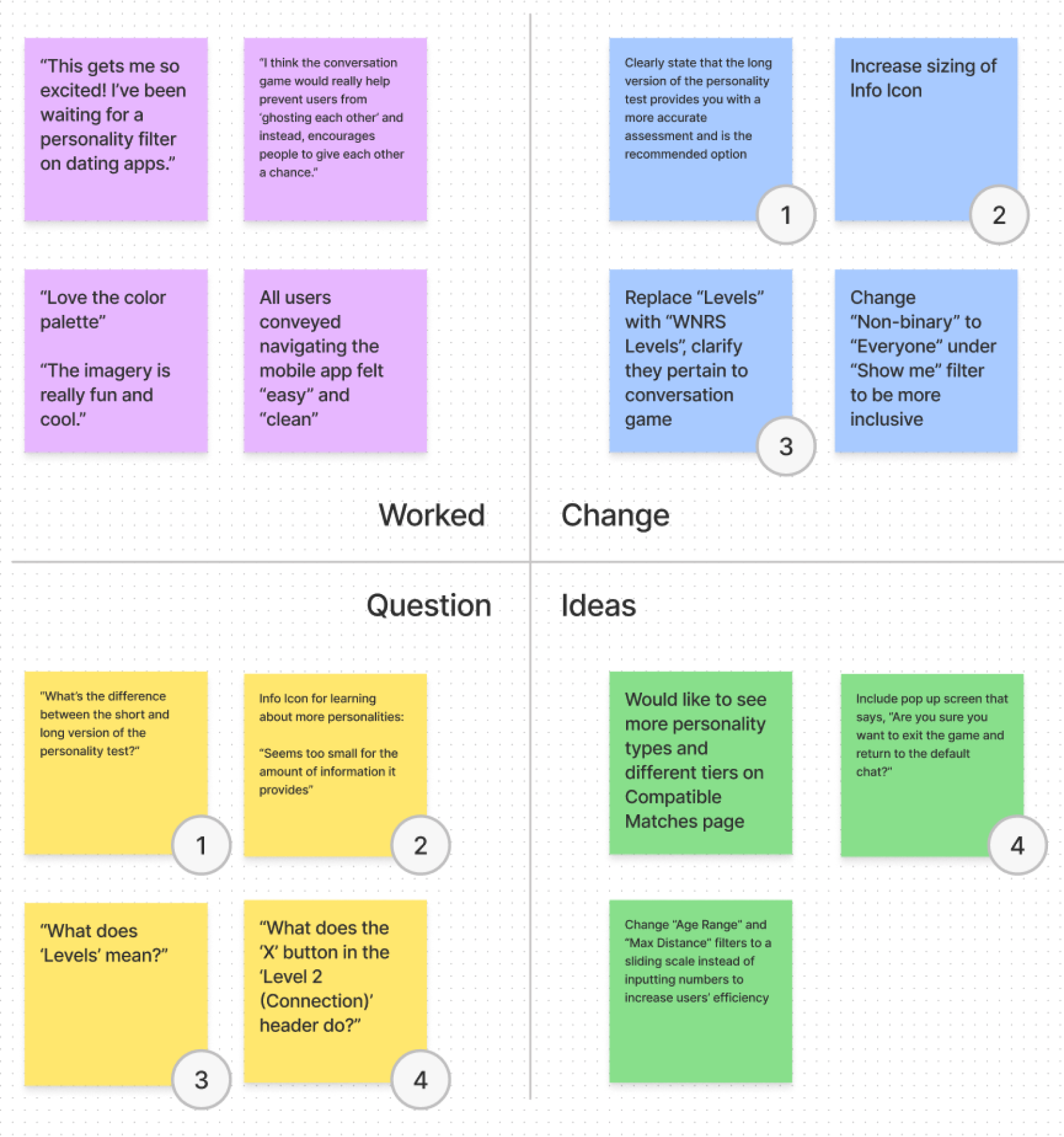
To prioritize what needs to be fixed, I identified 4 categories in a feedback grid:
In order to conduct usability testing, I created a desktop prototype using Figma.
Testing Objectives
- Do users have a clear understanding of how Wavelength works?
- how the Conversation Game works?
- Can users easily navigate the website?
- What areas cause frustration and confusion for users?
Usability Testing
By conducting usability tests with 5 dating app users, I was able to refine what users found useful and change items that were confusing. Users were asked to complete the task flow to test the main features of the app. They were also asked how they felt about the app in general.
Results
To prioritize what needs to be fixed, I identified 4 categories in a feedback grid:
- Things that worked
- Things that were questioned
- Things that need to be changed
- New ideas to consider
Iterate
Design Changes
Based off user feedback, I made the following iterations to create a newer, high-fidelity version of the app:
Final Product
After testing and iterations, my final product aligned with all the objectives I had set in place- it included the core features necessary for users to discover compatible personality types and engage in meaningful conversations. Users who tested my prototype were excited to use it in real life and commented that it felt like a “refreshing, modern twist on dating.”
Click here to view the final prototype.
Based off user feedback, I made the following iterations to create a newer, high-fidelity version of the app:
- Clearly stated that the long version of the personality test provides you with a more accurate assessment compared to the short version
- Increased sizing of Info Icon under “Choose Personality Types” section of Filters page to increase chances of users clicking on it to explore and learn about different personalities
- Clarified that the “Levels” pertains to the “Conversation Game Levels”
- Changed “Non-binary” to “Everyone” under Filters to be more inclusive
Final Product
After testing and iterations, my final product aligned with all the objectives I had set in place- it included the core features necessary for users to discover compatible personality types and engage in meaningful conversations. Users who tested my prototype were excited to use it in real life and commented that it felt like a “refreshing, modern twist on dating.”
Click here to view the final prototype.
Retrospective
What was your biggest challenge and how did you tackle it?
My biggest challenge was figuring out the information architecture of my product. I understood that not all my users would be familiar with the Myers Brigg test, so the onboarding process had to be clear and informative, without being too overwhelming. To solve this challenge, I provided users with the most critical information in the onboarding process, while also informing them that the option to explore and learn about different personality types would be available later on in the main navigation.
What did you learn from the process?
- Business Model Canvases are an invaulabe tool for startups, because it allows you to help communicate to clients your orginizational innovation strategy and why the should do business with you.
- Crazy 8’s, a fast sketching exercise that challenges people to sketch 8 distinct ideas in 8 minutes, is a great for ideating the information architecture of your product as it forces you to come up with a wide variety of solutions without getting too attached to one.
- Don’t force an idea if it isn’t working, find a new one. While I had originally created a moodboard to determine the UI of my product, I realized later it was hard to actually implement into my prototype. I decided to change my top-down approach to a bottom-up approach by creating one UI element and gradually building other elements of it.