
The Project
Memento is a time travel tourism application that I created as part of my UX Academy course at Designlab. As the sole UX/UI designer, I designed this project from inception to final design through research, ideation, and UX design principles
Duration: 4 weeks
Methods: Competitive Analysis, User Interviews, Personas, Card Sorting, Product Roadmpa, Site Map, Task Flow, Wireframes, Prototyping, Feedback Grid
Tools: Figma, Optimal Sort, Miro
Duration: 4 weeks
Methods: Competitive Analysis, User Interviews, Personas, Card Sorting, Product Roadmpa, Site Map, Task Flow, Wireframes, Prototyping, Feedback Grid
Tools: Figma, Optimal Sort, Miro
Context
Memento, a subsidiary of Richard Branson’s Virgin empire, is the first company to make time travel tourism become a reality and available to all. Memento has a total of 289 destinations (from prehistoric times through today) approved and finalized to receive people.
Despite the science of time travel being intricate and complex, Memento’s aim is to rival companies like SpaceX by offering novel experiences. My challenge was to build a responsive website that would allow potential travelers to seamlessly choose their destinations and book their travel tickets.
Despite the science of time travel being intricate and complex, Memento’s aim is to rival companies like SpaceX by offering novel experiences. My challenge was to build a responsive website that would allow potential travelers to seamlessly choose their destinations and book their travel tickets.
The Process
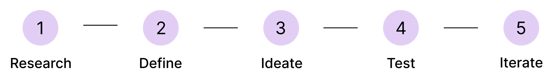
Research
Competitor Analysis
There are currently no direct competitors for Memento as time travel is yet to be on the market. Secondary competitors would be companies focusing on offering novel and innovative travel experiences, like Space X and Galactic. Indirect competitors would be companies offering other travel experiences, like Airbnb, Disney World, and National Geographic Expeditions.
User Interviews
With the goal of understanding users’ attitudes, expectations, goals, and safety concerns towards time traveling, I conducted 1:1 interviews with 4 individuals who plan and book travel accomodations at least 3 times a year. In these interviews, I also wanted to understand how people made use of existing travel websites, which features they thought were most important, and their pain points in planning trips.
Key Findings & Insights
The interviews helped me to understand more about the needs and frustrations of my users, and I was able to pull a few key findings that would help shape my project:

Users are motivated to travel by their curiosity and love for learning.

Users are motivated to time travel to (1) uncover truths and questions that we still have today and (2) experience important historical events, even if they were horrific or dangerous.

Google was a clear favorite among digital products used to decide, plan, or book travel. Users highlighted that they favored using Google as a travel tool because it’s all-encompassing and efficient; they don’t have to access other products/tools to fulfill additional needs.
Define
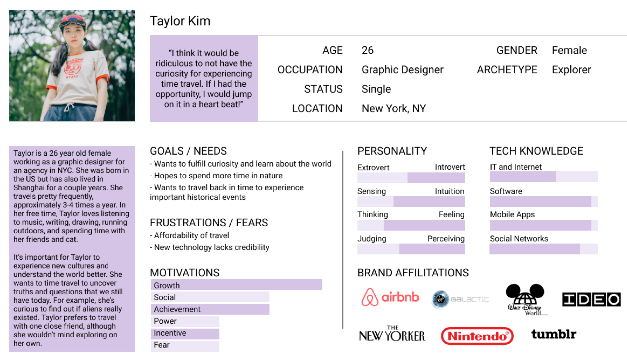
User Persona
Using the insights I gathered from my user interviews, I created a user persona to better understand the needs and frustrations of my users, and continued to revisit my persona in order to maintain a user-centric focus for the duration of the project.
Using the insights I gathered from my user interviews, I created a user persona to better understand the needs and frustrations of my users, and continued to revisit my persona in order to maintain a user-centric focus for the duration of the project.
Point of View (POV) Statements and How Might We (HMW) Questions
As the last step in the “Define” phase, I created POV statements to allow me to ideate and solve my design challenge in a goal-oriented manner in which I keep a focus on my users, their needs, and my insights about them. Once I defined my POVs, I started asking HMW questions to explore ideas that would help prepare me for the “Ideation” phase.
- How might we inspire millenials to learn and engage with the world?
- How might we create a product that is inclusive, streamlined, and efficient?
- How might we create and establish credibility and trust within our product?
- How might we help users discover an experience that caters to their specific preferences?
- How might we ensure that the checkout process is clear, transparent, and informative?
Ideate
Card Sorting
Using OptimalSort, I conducted a card sort to gain insight as to how users might expect the content, specifically destinations, to be organized and displayed. For this study, I recuited 8 participants who were given 20 cards with different events, locations, and time periods.
Using OptimalSort, I conducted a card sort to gain insight as to how users might expect the content, specifically destinations, to be organized and displayed. For this study, I recuited 8 participants who were given 20 cards with different events, locations, and time periods.

Key Findings & Insights
Most participants tend to group cards by:
Sitemap
Using the results from my card sorting, I created a sitemap.
Most participants tend to group cards by:
- Type of Event (War, Destruction, Creation, Achievement)
- Interests (Arts, Culture, Music, Sports, Politics)
- Historical Figures (Jesus, Cleopatra, Buddha)
- Time period (1960’s, Pre-Historic)
- Place of Event (Egypt, Asia, Ancient, Greece)
Sitemap
Using the results from my card sorting, I created a sitemap.

Task Flow
With my persona in mind, I created a task flow. This gave me a clear picture of the steps a user would need to take to get to their final goal and how to deliver this goal in the most intuitive way possible.
With my persona in mind, I created a task flow. This gave me a clear picture of the steps a user would need to take to get to their final goal and how to deliver this goal in the most intuitive way possible.

Wireframes
Following Taylor’s trip booking experience, I sketched low-fidelity wireframes with pen and paper before digitalizing them on Figma to create mid-fidelity wireframes. I prioritized creating the following pages: Home, Search, Destination Details, and Checkout.
Following Taylor’s trip booking experience, I sketched low-fidelity wireframes with pen and paper before digitalizing them on Figma to create mid-fidelity wireframes. I prioritized creating the following pages: Home, Search, Destination Details, and Checkout.
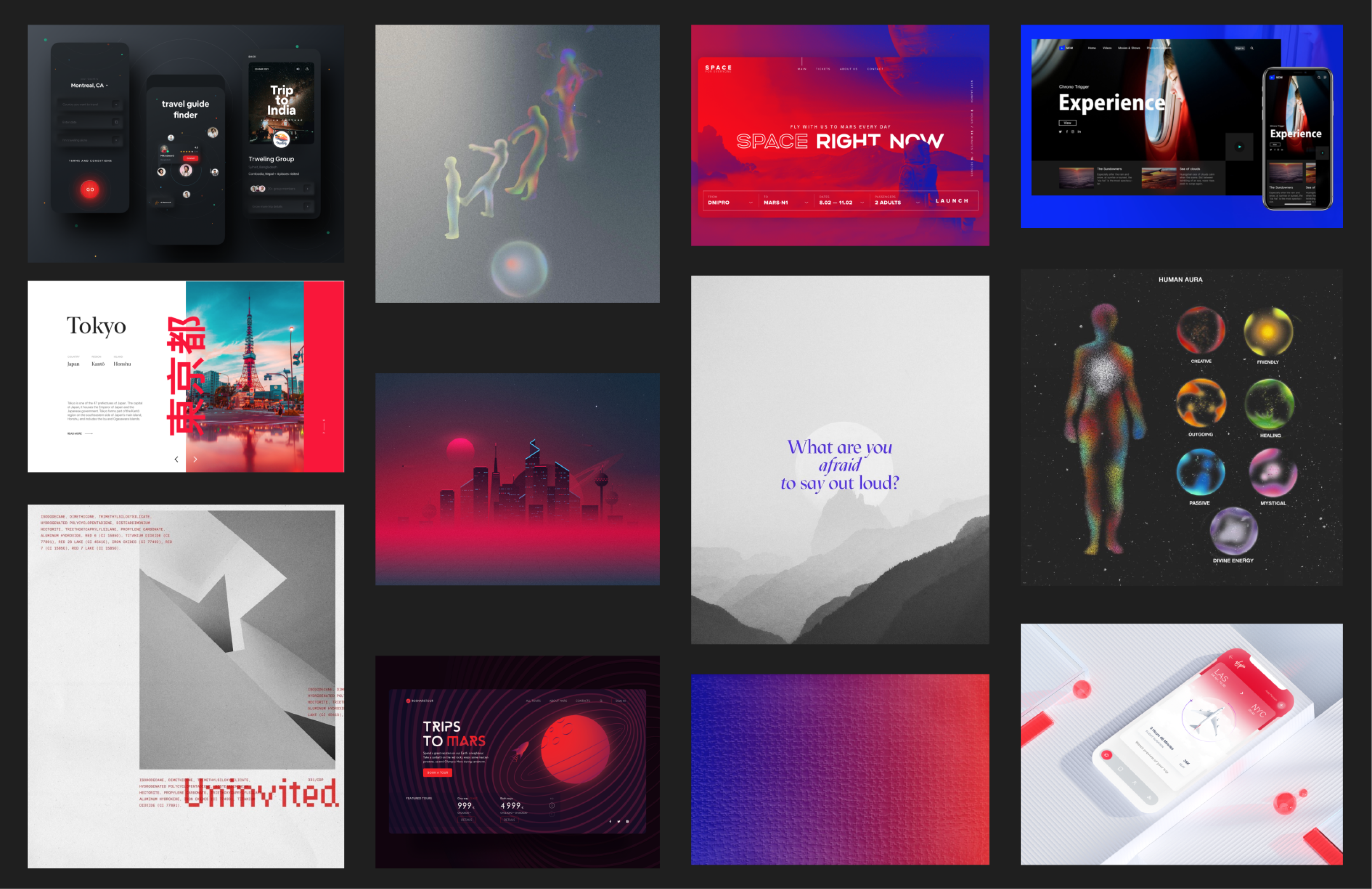
Moodboard
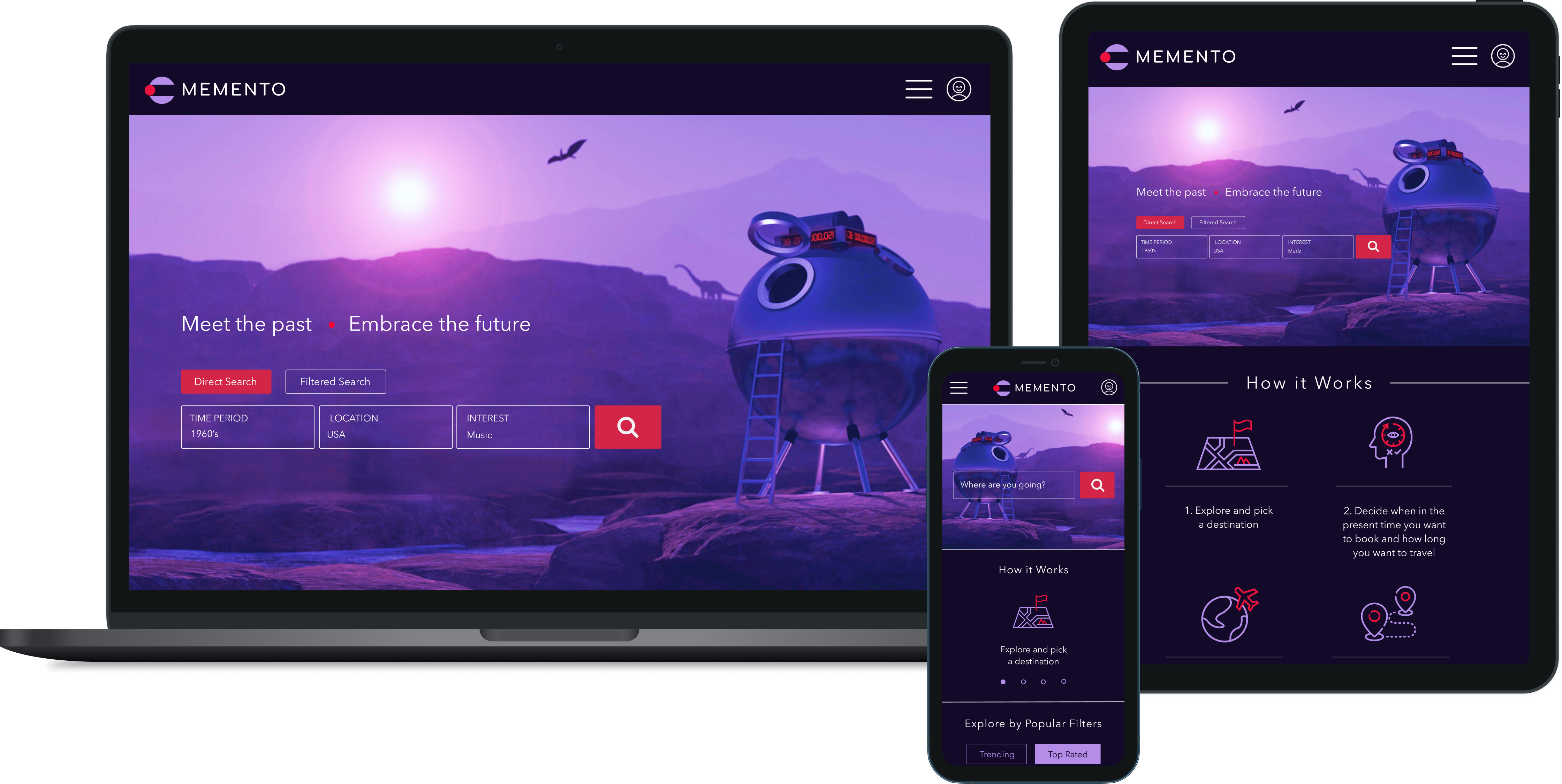
Next, I brainstormed the art direction of my site by looking for inspiration on various websites like Dribbble, Pinterest, Tumblr, and Behance. I decided to go with something that felt both futuristic and minimalistic by using a dark interface with purple and red as the brand colors. Purple reminded me of imagination, mystery, and intrigue– why people might be interested in Memento as a product. Red reminded me of the feelings such as passion, love, power, and anger– feelings users may witness and encounter by going back in time.
Next, I brainstormed the art direction of my site by looking for inspiration on various websites like Dribbble, Pinterest, Tumblr, and Behance. I decided to go with something that felt both futuristic and minimalistic by using a dark interface with purple and red as the brand colors. Purple reminded me of imagination, mystery, and intrigue– why people might be interested in Memento as a product. Red reminded me of the feelings such as passion, love, power, and anger– feelings users may witness and encounter by going back in time.
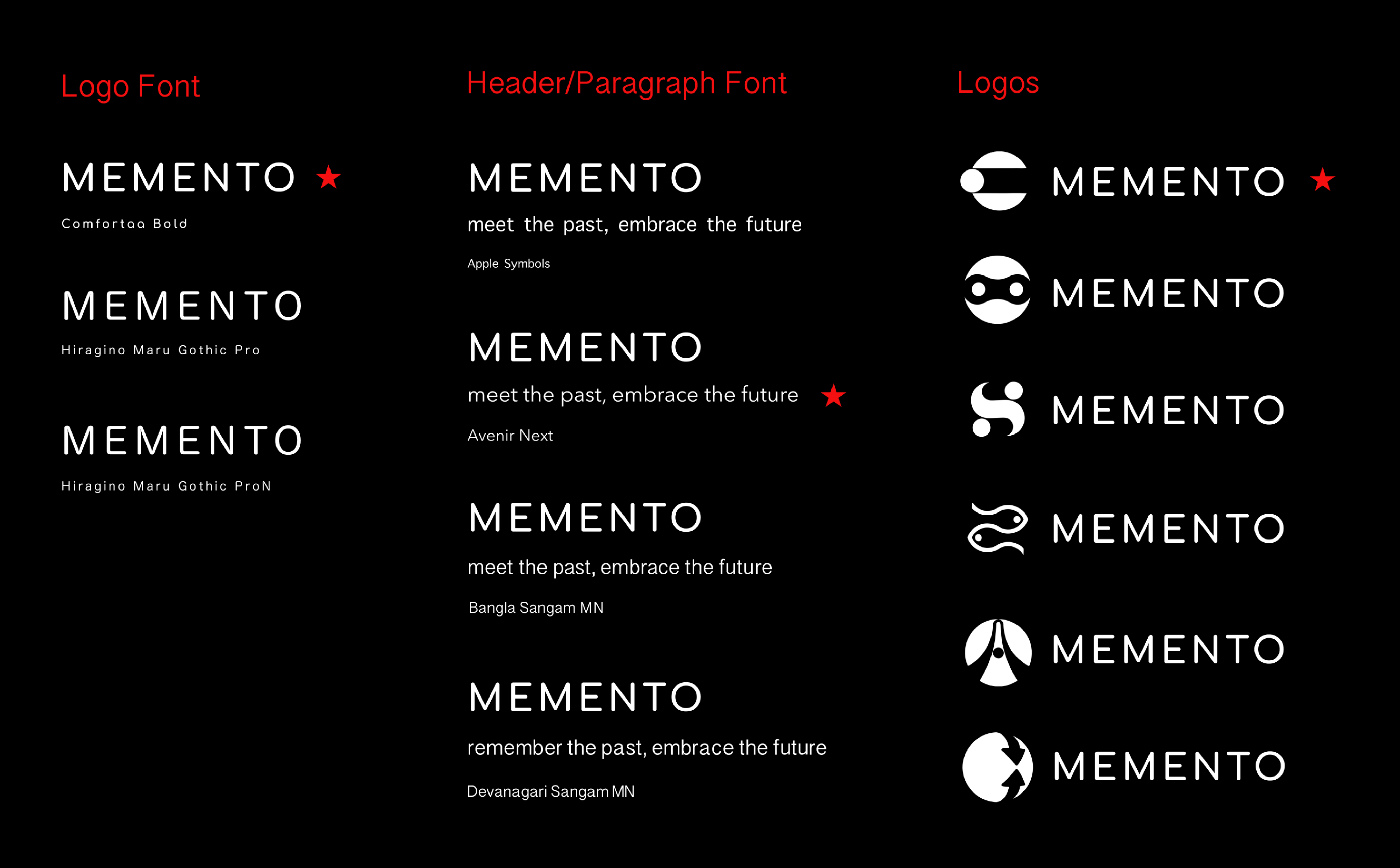
Branding and Logo
After defining my art direction, I started brainstorming brand names and logos by listing 20 adjectives that reminded me of the product. I decided to go with Memento as the brand name as it means “to remember” in Latin. After sketching my logo designs, I digitalized them through Figma and received feedback from my mentor and classmates before finalizing my decisions which are starred in red.
After defining my art direction, I started brainstorming brand names and logos by listing 20 adjectives that reminded me of the product. I decided to go with Memento as the brand name as it means “to remember” in Latin. After sketching my logo designs, I digitalized them through Figma and received feedback from my mentor and classmates before finalizing my decisions which are starred in red.

UI Kit
Following Memento’s brand identity (futuristic & minimalistic), I crafted a logo, color palette, font pairing, buttons, and other stylistic elements to create a comprehensive UI kit.
Following Memento’s brand identity (futuristic & minimalistic), I crafted a logo, color palette, font pairing, buttons, and other stylistic elements to create a comprehensive UI kit.

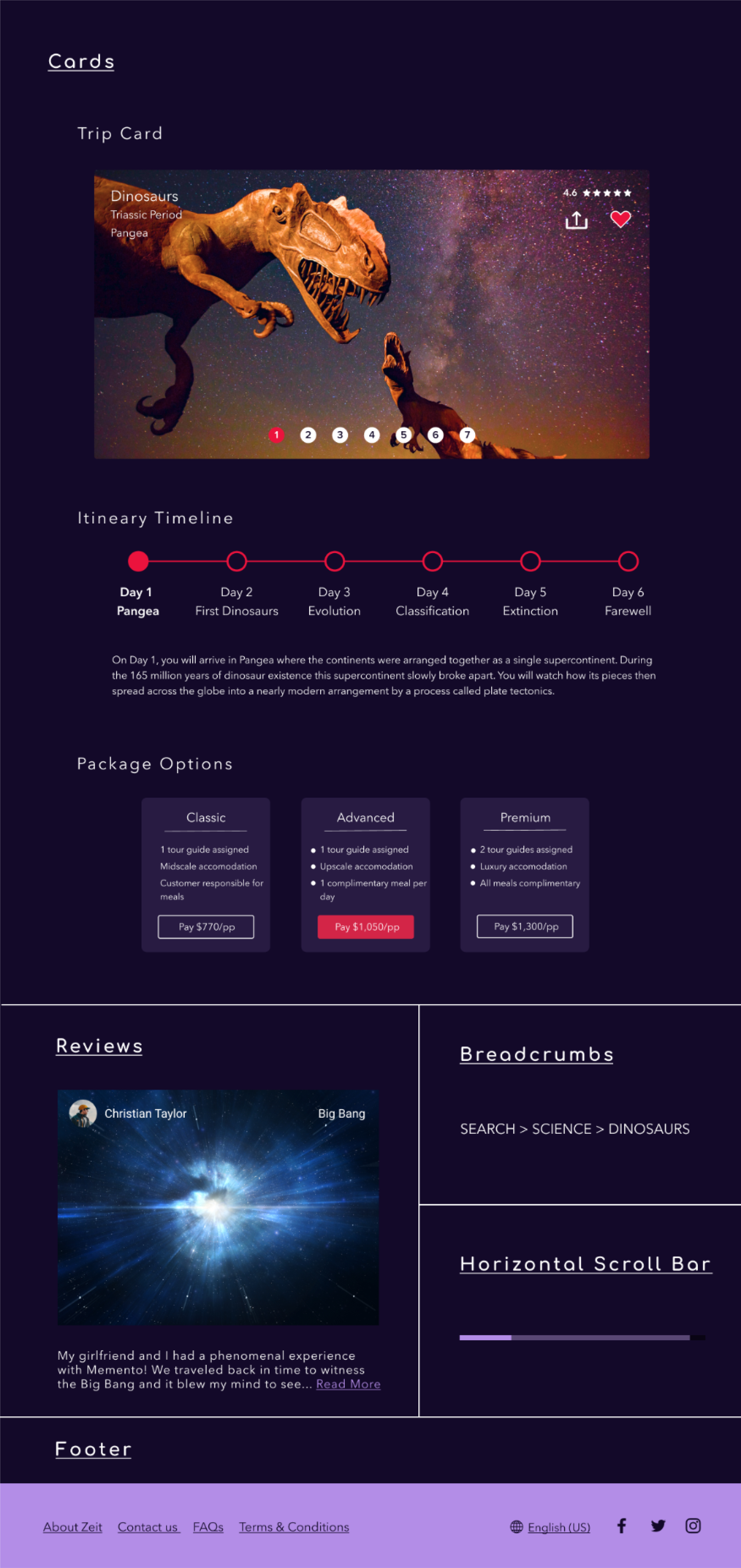
UI Designs
By applying the visual design to my wireframes, I created responsive UI designs for the following pages: Home, Search, Destination Details, Checkout, Trip Confirmation.
By applying the visual design to my wireframes, I created responsive UI designs for the following pages: Home, Search, Destination Details, Checkout, Trip Confirmation.
Test
Prototype
In order to conduct usabiliy testing, I created a desktop prototype using Figma.
Testing Objectives
and book 2 tickets with the “Advanced” package option
Usability Testing
By conducting usability tests with 5 frequent travelers, I was able to refine what users found useful and change items that were confusing. Users were asked to complete a scenario-based task that would test the main features of the app. They were also asked how they felt about the app in general.
Results
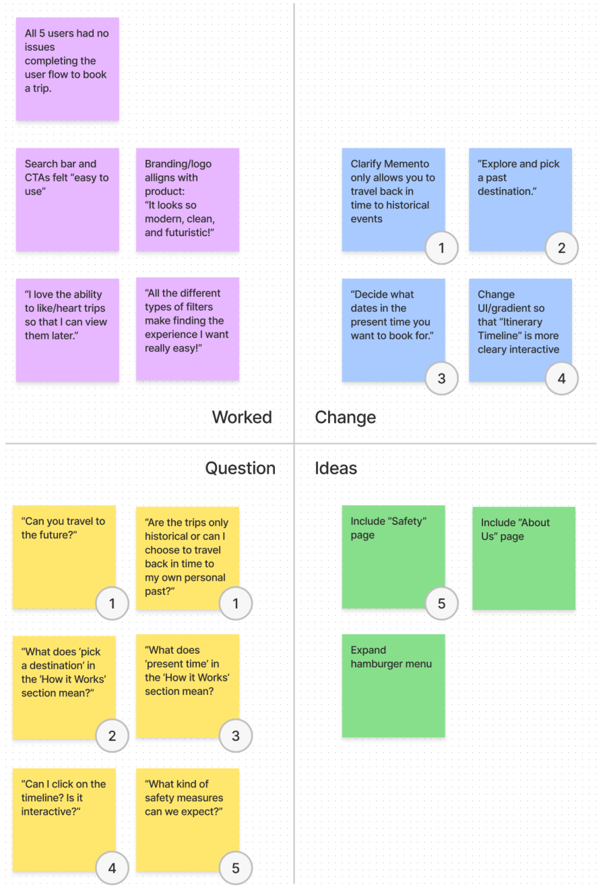
To prioritize what needs to be fixed, I identified 4 categories in a feedback grid:
In order to conduct usabiliy testing, I created a desktop prototype using Figma.
Testing Objectives
- Do users have a clear understanding of how Memento works?
- Can users easily navigate the website?
- Observe any areas of difficulty
- Test specific user flow:
and book 2 tickets with the “Advanced” package option
Usability Testing
By conducting usability tests with 5 frequent travelers, I was able to refine what users found useful and change items that were confusing. Users were asked to complete a scenario-based task that would test the main features of the app. They were also asked how they felt about the app in general.
Results
To prioritize what needs to be fixed, I identified 4 categories in a feedback grid:
- Things that worked
- Things that were questioned
- Things that need to be changed
- New ideas to consider
Iterate
Design Changes
Based off user feedback, I made the following iterations to create a newer, high-fidelity version of the app:
Final Product
After testing and iterations, my final product aligned with all the objectives I had set in place- it included the core features necessary for users to discover and book a trip seamlessly, while appearing visually appealing.
Click here to view the final prototype.
Based off user feedback, I made the following iterations to create a newer, high-fidelity version of the app:
- Reworded “How it Works” section on the home page to clarify that Memento only allows you to travel back in time to historical events
- Changed gradient on the destination details page so that the “Itinerary Timeline” is more clearly interactive and clickable
Final Product
After testing and iterations, my final product aligned with all the objectives I had set in place- it included the core features necessary for users to discover and book a trip seamlessly, while appearing visually appealing.
Click here to view the final prototype.
Retrospective
What would you do differently?
My biggest challenge was conducting the usability testing. In my prototype that I used for testing, I focused on creating interactions necessary to complete the scenario-based task. However, I noticed that users were frustrated that some of the buttons weren’t fully functioning, and this may have negatively affected how users felt about the app overall. In the future, I would spend more time creating a prototype that is fully functioning to minimize this confusion and frustration.
What did you learn from the process?
Next Steps
My biggest challenge was conducting the usability testing. In my prototype that I used for testing, I focused on creating interactions necessary to complete the scenario-based task. However, I noticed that users were frustrated that some of the buttons weren’t fully functioning, and this may have negatively affected how users felt about the app overall. In the future, I would spend more time creating a prototype that is fully functioning to minimize this confusion and frustration.
What did you learn from the process?
- New products that haven’t been introduced to the market require more background information so that users clearly understand what your product offers.
- The importance of utilizing design patterns to your advantage.
- The importance of keeping my user persona at the forefront of all my design decisions.
Next Steps
-
Create an “About” page and “Safety” page for Memento